5 Groundbreaking Examples of Multilingual Websites
What is a multilingual website?
A multilingual website is considered to be any site that has content published in multiple languages. Brands might consider investing in this type of website if they’re trying to attract clients who speak different languages. This step often comes as a natural result of localization and globalization efforts.
In this article, we’re highlighting different strategies you can use if you’re looking to optimize your multilingual website, ranging from your homepage to your drop-down menu. We’ll also be giving you tangible examples you can reference as you take the time to pursue multilingual SEO and website content optimization.
Benefits of Building a Multilingual Website
Before we begin optimizing website translation, it’s important to define the “why” behind the process—exploring the many possible benefits you can get as a result. We’ve summarized these steps below:
- User experience (UX) optimization: Engaging with your core clientele in their language of choice instantly boosts your brand awareness and perception. Starting the localization process can be simple, even if you only have the resources for the site translation part of the strategy. After you’ve made your content in English, consider branching out into other common languages that you see both inside and outside of the U.S., such as Italian, Spanish, French or German.
- High-quality engagement and effective expansion: When you bolster your site’s functionality to appear “valuable” to search engines in other countries, you are taking steps to actively expand your markets and reach.
- Increased sales: The natural result of these efforts, if done correctly, is increased sales over time. You have the potential to win new customers and keep old ones, extending their average lifetime value.
5 Groundbreaking Examples of Multilingual Websites
Looking for an example of sites produced outside of the brand’s native language? We’ve rounded up five of the top examples in the industry that have used this strategy to expand their customer base.
1. Apple
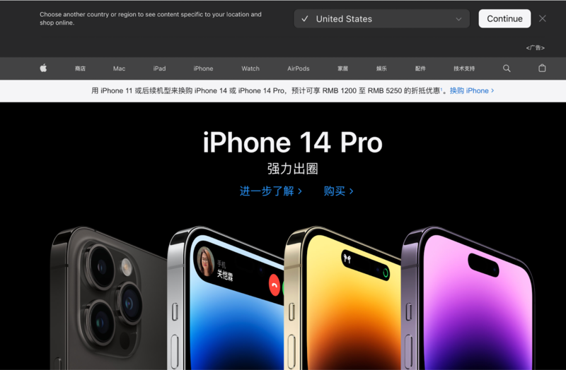
Beyond offering different full-site experiences in a range of different global languages (such as Russian and Chinese), the site has taken it a step further and extended this multilingual site experience to key touchpoints in the customer journey—which can be easily changed to someone’s preferred language through a few taps on your smartphone. This includes instant translation across social media displays, web pages, ecommerce areas (such as the app store) and keyboards.
Users can engage with the multi-language website or other languages that align with their native languages using the phone’s language switcher, housed under the language options area. The interface also has support for right-to-left language types, such as Japanese.
This level of inclusion and support has been one of the main reasons that Apple has been able to evolve as an industry leader and a majorly competitive global brand.
2. Bluetooth Special Interest Group
Bluetooth took a different, higher-level approach regarding the need for high-quality, translation-friendly innovation and technology. As a result, the company formed a not-for-profit branch dedicated to making this a reality around the world: The Bluetooth Special Interest Group, or SIG.
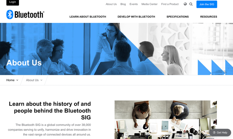
Their scope includes all types of technology and the functionality of each, working to make the current advancements as accessible as possible across all languages and regional preferences. Their focus remains on the interoperability of devices in this scope, spanning technology that exists around the globe. The SIG’s focus on this has continued to set the standard for other brands in the industry, potentially prompting wide-scale change.
3. IKEA
IKEA has taught many other major retailer brands and e-commerce websites the benefits of pursuing standardization and localization simultaneously — all while remaining true to their brand identity and appearance.
Despite IKEA’s rapid expansion, the brand offers a similar experience across all continents and countries. They have similar website design elements, colors and template options, all of which can be translated into whatever language site preferences a user has. The same concepts apply in-store as well, giving a user an “expected” and comfortable shopping experience that promotes feelings of familiarity and recognition.
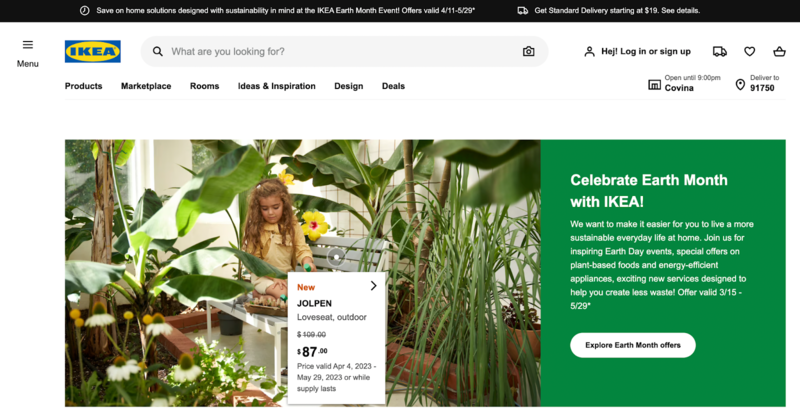
For example: While the store’s familiar, template feel can prompt a sense of expectation, IKEA then breaks out of the standardization steps and focuses on localization. We see this with customized, translated store header signs, multilingual sites and instructions that are designed to serve the buyers in their new markets.
Click to learn more about IKEA’s rapid (and successful) expansion process and strategy.
4. Nike
Nike is a classic brand name that many are familiar with—and it’s a fantastic case study of what localization can look like when it’s applied to tangible design elements.
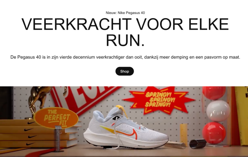
One of the most recent examples includes Nike Rise, which is Nike’s latest expansion project slated to open hundreds of additional locations around the globe. Key elements of design structure in this area of expansion include:
- Smaller spaces. The store wanted to make an impact on suburban and urban populations, which have notoriously limited space on their crowded streets. Rather than invest in large-scale flagship stores, Nike opted to go with a “small business look,” taking up less of a footprint without compromising value.
- Wide-open windows. Similar to the look of their web design and search engine optimization (SEO) strategy, Nike has opted for a very “wide-open” and airy store design—featuring broad, floor-to-ceiling windows in many of their Rise locations.
- Website optimization. Nike’s initial “athletes-only” clothing design and site structure has given way to a more open and flexible web design, welcoming urban style-seekers and workout fans alike. You can enjoy the English version of Nike’s site, or toggle to different options outside of the English language — using the automatic translation “switcher” on the bottom of the site. Users can explore Arabic, Portuguese and Swedish versions of the site in just a few clicks.
5. Nikon Canada
Nikon Canada has focused on localization and currency support, site elements and switching in-site — something that many corporate entities struggle to execute well.
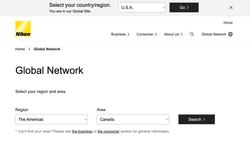
When you visit Nikon’s global site, you’ll be prompted to select your region and area. After you do so, you’ll be automatically directed to a site that is optimized for each user in a more minute or detailed skill than most are used to seeing.
If you scroll, you’ll see the range of Nikon products that are available across industries, such as the medical/biological microscopes that are available alongside their other more mainstream lines. Users can explore different versions and translations of the instructions and relevant information, available in a single-click site experience depending on your region.
Create a Strong Multilingual Website with OneSky
Multilingual websites are fantastic marketing tools that can promote a more complete localization and globalization strategy. There are many global companies that have used this strategy to springboard their success, such as Nike, IKEA and Apple. OneSky’s expert team of translators is available to support your successful content translation into 50+ languages—promoting your brand identity and awareness around the globe. Connect with us today to start using OneSky at no cost to you.



 Written by -


 Written by
